

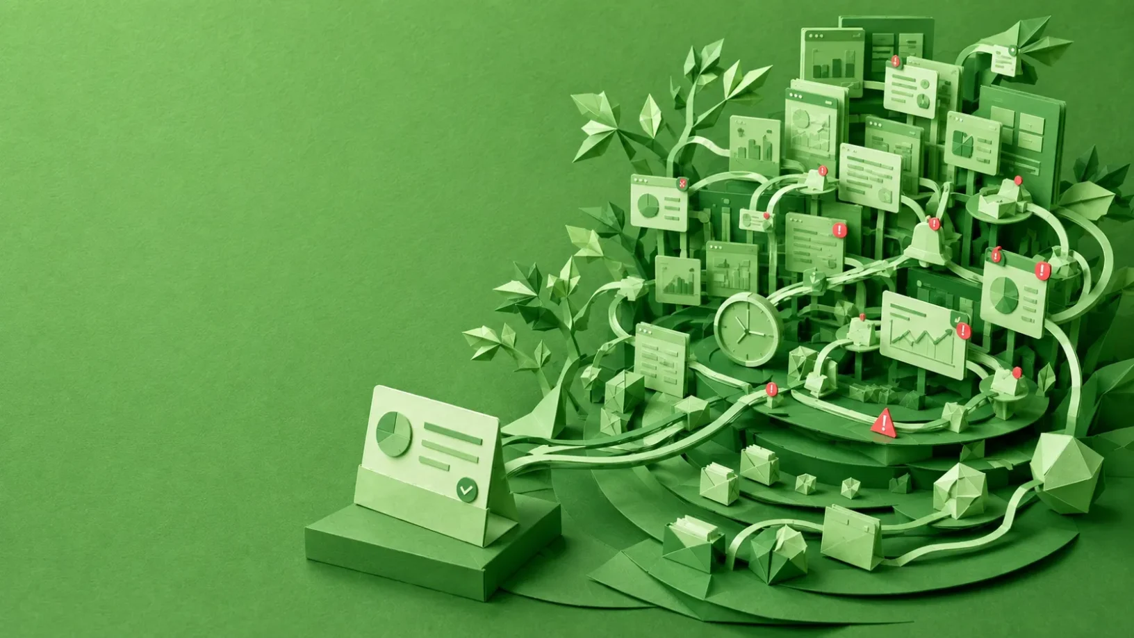

Imagine a banking analyst beginning the morning with a customer case open.
There are account details, transaction histories, risk indicators and compliance information on the screen. A second system contains supporting documents. A message arrives from a colleague. Another case is marked urgent. An automated alert appears. The analyst opens a spreadsheet to compare something that the main application does not show clearly.
Then a phone call interrupts the investigation.
Twenty minutes later, the analyst returns to the original case.
The interface has not changed.
The analyst has.
Some of the context that was clear twenty minutes ago now has to be reconstructed. Why was that transaction suspicious? Which document had already been checked? What was the next thing that needed verification?
Now repeat some version of this for eight hours.
This is where our usual understanding of usability starts to feel incomplete.
A product might be perfectly usable when someone sits down for a 10-minute usability test. The navigation is understandable. The information is readable. The user successfully completes the task.
But what happens when that product becomes someone’s working environment?
What happens after the fifteenth case, the twentieth interruption, the repeated alerts, the constant comparison of information and the need to keep switching between systems?
A product can be easy to use for five minutes and exhausting to use for eight hours.
The Five-Minute Usability Problem
Product teams naturally break experiences into tasks.
Find a transaction.
Review a claim.
Update a customer record.
Approve an application.
Investigate an alert.
Record a medical observation.
Designers build flows around those tasks, then test whether people can complete them.
There is nothing wrong with that. Task-level usability is fundamental.
But for many enterprise products, the individual task is only a small unit inside a much larger system of work.
A fraud analyst does not investigate one transaction and go home. A healthcare professional does not read one patient record. An accountant does not analyse one financial signal. A data-entry employee does not enter one record.
They may spend seven, eight or nine hours moving through information-heavy systems while simultaneously handling messages, meetings, exceptions, alerts and interruptions.
That creates a distinction I find useful:
Task usability asks whether a person can complete the task.
Workday usability asks what repeatedly completing those tasks does to the person.
These are not established academic categories. They are a design lens.
And in the era of big data, that second question may deserve far more attention.
Big Data Solved One Problem and Exposed Another
For much of computing history, obtaining information was expensive.
Now many organisations face almost the opposite problem.
Applications can collect enormous amounts of behavioural, operational, financial, clinical and customer data. Business intelligence systems can expose more variables. Monitoring systems can generate more alerts. AI systems can identify more patterns. Storage is cheaper, processing is faster and organisations have more opportunities to combine internal and external datasets.
Accounting research provides one illustration. Hartmann and Weißenberger’s systematic review describes an environment shaped by larger amounts of data, more powerful business-intelligence systems, automated decision-making and big-data technologies. Their review also finds a recurring pattern in the literature: beyond a certain point, greater information load can be associated with lower decision accuracy, longer decision time and stronger feelings of overload. [1]
More information can improve a decision.
Until it doesn’t.
Decades of information-overload research suggest that the problem cannot be reduced simply to the number of items on a screen. Reviews by Eppler and Mengis, Roetzel, and more recently Arnold, Goldschmitt and Rigotti describe a broader system involving characteristics of the information, people’s capacity to process it, the task being performed, organisational processes and the technology through which the information arrives. The evidence for many proposed remedies is also mixed. [2] [3][4]
That changes the product-design question.
Instead of asking only:
How much information should we display?
we may need to ask:
What work are we forcing the human mind to perform with that information?
Information Overload Is Not the Same as Information Quantity
Consider two interfaces containing roughly the same underlying information.
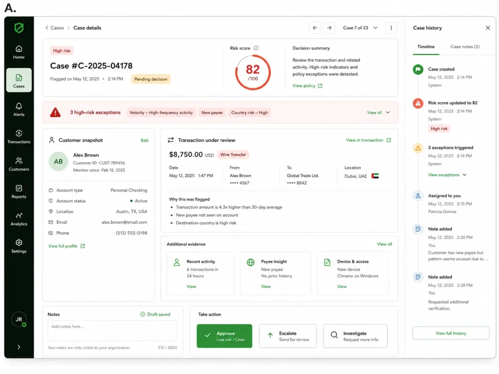
On the first (image A), the information needed for the current decision is grouped around the task. Important exceptions stand out, relevant history can be reached without breaking the workflow, and the system preserves the analyst’s progress if they leave and return.
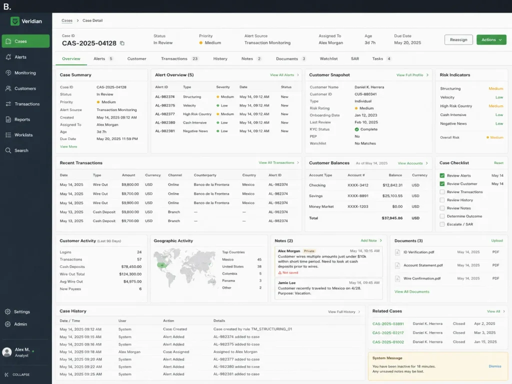
On the second (image B), the same information exists, but it is scattered across tabs or screens. The analyst has to remember values while moving between them, routine information competes visually with important warnings, and after switching to another case or responding to an alert, they may have to reconstruct what they were doing when they return.
The amount of information may be the same.
The cognitive work required to use it is not.
That is why “simplify the interface” can become misleading advice.
A medical professional may genuinely need a large amount of information before making a decision. So might a fraud analyst, financial analyst, compliance professional or insurance assessor.
Removing necessary information does not solve information overload. It may simply create information underload.
The design problem is therefore not always to show less.
It is to reduce the unnecessary cognitive work required to turn information into a decision.
A Workday Is Not One Continuous Task
Information-heavy work also rarely happens without interruption.
Speier, Valacich and Vessey’s experiments found that interruptions affected simple and complex decision tasks differently. Interruptions could improve performance on simpler tasks, but reduced performance on complex ones, particularly as interruptions became more frequent or differed from the primary task. [5]
That distinction matters because many professional tools exist precisely because the work is complicated.
An analyst may be constructing a mental model from several pieces of evidence. A clinician may be considering how multiple signals relate to one another. A financial professional may be comparing current information with historical patterns.
Then another task arrives.
The cost is not simply the thirty seconds spent reading a notification.
The person has to leave one goal, establish another and eventually recover the mental context of the first.
Trafton and colleagues studied this recovery process experimentally. They found that people resumed interrupted tasks more quickly when they had a brief opportunity to prepare for the interruption. Their work helps explain what is often called resumption lag, the time required to recover enough context to continue the previous task. [6]
More recent research brings the problem into modern digital work. In a 2023 experiment involving 247 participants, Sandra Ohly and Luca Bastin found that reducing automatic communication notifications for a workday improved perceived performance and reduced strain. [7]
Now the product-design problem is no longer confined to the screen.
The notification system matters.
Task persistence matters.
The organisation’s expectation of immediate responsiveness matters.
The interaction between several products matters.
And this is where we encounter another problem.
Is the Dashboard Really the User’s Job?
A product team may spend months designing a dashboard.
For the team, the dashboard is the product.
For the employee, it may be one window among ten.
The employee’s job is not to use the dashboard.
The job might be to decide whether a transaction is fraudulent.
To understand why revenue changed.
To identify a patient whose condition is deteriorating.
To approve the right insurance claim.
To reconcile an inconsistency.
To decide what deserves attention next.
The dashboard is only one participant in that process.
This sounds obvious, but product architecture often tells a different story.
Systems are commonly organised around the data an organisation owns: customers, accounts, transactions, reports, documents, alerts, cases and metrics.
The worker’s mental model may instead be organised around questions:
What changed?
What needs attention?
What is unusual?
What have I already checked?
What should I do next?
What can safely wait?
A dashboard can successfully display everything the business asked for while still forcing the employee to perform the difficult work of locating, comparing, remembering and prioritising information.
When the Same Data Becomes Easier to Understand
Research from healthcare gives us a small but useful illustration.
Faiola, Srinivas and Duke recruited 12 ICU clinicians, six physicians and six nurses, and divided them into two groups. One group used traditional paper medical charts. The other used a visual dashboard called MIVA 2.0. Both groups worked with the same 12 hours of patient data and answered the same eight clinical questions. [8]
Imagine being asked to identify when a patient’s pulmonary artery pressure began to rise.
With a traditional chart, the clinician had to examine recorded values and reconstruct the trend. MIVA presented the clinical measurements visually over time so changes and relationships could be seen more directly.
Across the eight questions, clinicians using MIVA gave more correct answers overall. They were not faster on every question, but they were significantly faster on two of the eight questions. [8]
It was a very small study, so we should not generalise too far from it. But it illustrates an important distinction:
Displaying data and supporting cognition are not necessarily the same thing.
A dashboard should not merely answer:
“What data do we have?”
It should help answer:
“What does the person need to understand or decide?”
That is a much larger argument, and one worth returning to separately.
The Product Can Become Part of the Cognitive Workload
Healthcare provides some of the clearest evidence because electronic health records have been studied extensively and the consequences of poor information handling can be serious.
Pfaff and colleagues used cognitive task analysis with experienced clinicians to examine the demands created by electronic health records. They identified 145 cognitive demands across 22 themes. Among the major findings were difficulties maintaining awareness of the broader clinical picture and limitations in how EHRs supported reasoning about a patient’s current and future state. [9]
Alerts add another layer.
Gregory, Russo and Singh studied 16 primary-care providers and found that perceived alert workload was associated with physical fatigue and cognitive weariness. Participants asked for fewer unnecessary alerts, improvements to the EHR and protected time for handling alert-related work. The sample was small, so the result should be treated cautiously. [10]
A larger retrospective study by Ancker and colleagues examined EHR alert behaviour across 112 primary-care clinicians. Clinicians became less likely to accept alerts as they received more of them, particularly when the alerts were repeats for the same patient. Importantly, the study did not find a simple relationship between overall workload and alert acceptance. [11]
The lesson extends beyond healthcare, although we should not assume identical effects in banking, fintech or other industries without equivalent evidence.
A notification can be locally reasonable and globally harmful.
The compliance team wants its alert. The fraud team wants its alert. Operations wants its alert. The messaging platform wants immediate visibility. The task-management system wants a badge.
Each decision can make sense when considered separately.
But the employee experiences them together, as overlapping demands competing for the same attention.
That is a systems problem.
Are We Designing the Cognitive Work, or Just the Interface?
Perhaps one of the most useful questions during product design is:
What is the human being being asked to remember, reconstruct, compare, filter and prioritise?
If a user repeatedly has to remember a value while navigating between screens, the system is outsourcing memory to the employee.
If an analyst has to inspect twenty alerts to discover which two actually require action, the system is outsourcing prioritisation.
If someone returns from an interruption and has to reconstruct why a case was suspicious, the system is outsourcing context preservation.
If a person must open three applications to understand the state of one customer, the system is outsourcing information integration.
Not all cognitive work should disappear.
Professional work often requires interpretation, judgement and experience. Good design should not try to remove that thinking. It should reduce the unnecessary mental effort around the work, so people can focus their attention on the decisions that actually require expertise.
A fraud analyst should spend cognitive effort deciding whether evidence indicates fraud.
The analyst should not have to spend the same scarce attention remembering which tab contained the evidence.
A clinician should think deeply about the patient’s condition.
They should not need to think deeply about where the software placed yesterday’s observation.
The goal is not minimum information.
It is minimum unnecessary cognitive work.
Should we consider interruption as part of the interface?
Once we accept that interruption is part of the work rather than an exception to it, some familiar product decisions look different.
Saving form data automatically is useful.
But preserving cognitive state may be even more useful.
Where was the employee in the investigation?
What had already been reviewed?
Which assumptions had been ruled out?
What changed while the task was parked?
What is the next unresolved question?
Products often preserve database state extremely well while preserving human mental state poorly.
That may be one of the more interesting opportunities in enterprise UX.
Small Examples Already Exist
We already see limited versions of this thinking in familiar products.
Google Docs automatically saves changes as the user types, and its version history allows people to inspect or restore earlier states of a document. That primarily preserves the work state.
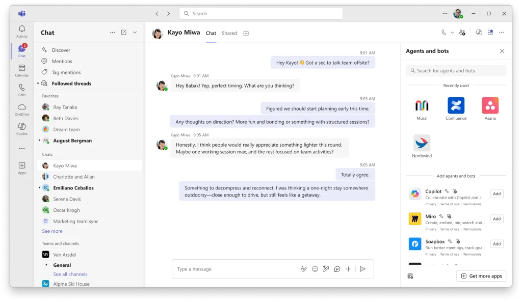
Microsoft Teams provides an example that comes a little closer to preserving working context. Microsoft says Teams can preserve a user’s chat layout and open panels while they move between conversations, allowing them to return to where they left off.
These are relatively simple examples, but they point toward a larger opportunity.
Enterprise software could remember not only what was saved, but also what the user was trying to understand, investigate or decide.
What if we tested the interruption, not just the happy path?
Instead of designing only the ideal path from task start to completion, product teams could deliberately test interruption.
Give the analyst a case.
Interrupt them halfway through.
Give them another task.
Then return them to the original case twenty minutes later.
What happens?
How quickly can they understand where they were?
What do they have to remember or repeat?
What mistakes become possible?
That exercise may expose problems a conventional task-completion test never reveals.
Progressive Disclosure Cannot Solve the Whole Problem
A common response to information density is progressive disclosure: show the essentials first and reveal more detail when needed.
It is a powerful design technique.
But it can also become an oversimplification.
Expert users sometimes need dense information because relationships between pieces of data matter. Hiding everything behind additional interactions can introduce navigation costs, make comparison harder and force users to remember what they saw on a previous screen.
The question is not simply whether information should be visible or hidden.
It is whether information appears in the right context, with the right priority, at the right moment, for the decision being made.
Sometimes that means showing less.
Sometimes it means visualising a relationship instead of presenting ten disconnected numbers.
Sometimes it means preserving the context of an interrupted task.
And sometimes the right product decision is to stop generating information nobody needs.
We May Be Measuring Usability Over the Wrong Timescale
Suppose two versions of an application both allow someone to complete a task in four minutes.
By conventional task metrics, they appear equally efficient.
But imagine that one version requires the user to continuously remember information from previous screens, while the other keeps the relevant context visible.
On the first task, the difference may be negligible.
After fifty tasks, it might not be.
The same applies to alerts, repetitive navigation, context switching and small interruptions.
Many interface decisions create tiny costs.
Tiny costs repeated hundreds of times become a working environment.
That suggests product research for high-frequency professional software should sometimes move beyond:
Can users complete this?
How long did it take?
How many errors occurred?
Those measurements still matter.
But we should also ask cumulative questions.
What happens after two hours?
How easily can someone resume after repeated interruptions?
Which information are users keeping in their heads?
Where are they creating external memory aids such as spreadsheets, notes or sticky notes?
Which alerts are habitually ignored?
These questions examine the system around the interface, not only the interface itself.
The Eight-Hour User Changes the Design Problem
Big data has given organisations an extraordinary ability to collect information.
AI may increase our ability to interpret and generate even more of it.
But human attention has not expanded alongside our databases.
That does not mean we should romanticise simplicity or strip professional software of complexity.
Complex work will remain complex.
The more useful ambition is different:
Do not make the interface add unnecessary complexity to work that is already difficult.
Don Norman makes a similar point through much simpler everyday objects in The Design of Everyday Things. His examples of controls and appliances illustrate the importance of natural mapping: when the relationship between a control and what it operates is unclear, the person has to remember or work out the connection. When the arrangement itself makes the relationship obvious, that unnecessary mental work disappears.
Consider a stove with four burners. If its controls do not clearly correspond to the physical arrangement of those burners, the user has an extra problem to solve: which control operates which burner?
Arrange the controls so their relationship to the burners is obvious, and the cooking itself has not become simpler.
The design has simply stopped making the person solve an additional problem.
Professional software deserves the same consideration.
For products used occasionally, a five-minute interaction may be a reasonable unit of design.
For products used by analysts, clinicians, operations employees, researchers, finance teams and data-entry workers throughout the day, the product has another responsibility.
It becomes part of someone’s cognitive environment.
And once we see the product that way, usability is no longer only about whether a person can complete the next task.
It is also about whether the system helps them remain capable of making the next decision, and the one after that, several hours later.
A product can be easy to use for five minutes.
The harder design question is what happens at hour eight.
Research Referenced
- Hartmann, M., & Weißenberger, B. E. (2024). Information overload research in accounting: a systematic review of the literature. Management Review Quarterly, 74, 1619–1667.
- Eppler, M. J., & Mengis, J. (2004). The Concept of Information Overload: A Review of Literature from Organization Science, Accounting, Marketing, MIS, and Related Disciplines. The Information Society, 20(5), 325–344. doi:10.1080/01972240490507974.
- Roetzel, P. G. (2019). Information overload in the information age: a review of the literature from business administration, business psychology, and related disciplines with a bibliometric approach and framework development. Business Research, 12, 479–522. doi:10.1007/s40685-018-0069-z.
- Arnold, M., Goldschmitt, M., & Rigotti, T. (2023). Dealing with information overload: a comprehensive review. Frontiers in Psychology, 14, 1122200. doi:10.3389/fpsyg.2023.1122200.
- Speier, C., Valacich, J. S., & Vessey, I. (1999). The Influence of Task Interruption on Individual Decision Making: An Information Overload Perspective. Decision Sciences, 30(2), 337–360. doi:10.1111/j.1540-5915.1999.tb01613.x.
- Trafton, J. G., Altmann, E. M., Brock, D. P., & Mintz, F. E. (2003). Preparing to resume an interrupted task: effects of prospective goal encoding and retrospective rehearsal. International Journal of Human-Computer Studies, 58(5), 583–603. doi:10.1016/S1071-5819(03)00023-5.
- Ohly, S., & Bastin, L. (2023). Effects of task interruptions caused by notifications from communication applications on strain and performance. Journal of Occupational Health, 65(1), e12408. doi:10.1002/1348-9585.12408.
- Faiola, A., Srinivas, P., & Duke, J. (2015). Supporting Clinical Cognition: A Human-Centered Approach to a Novel ICU Information Visualization Dashboard. AMIA Annual Symposium Proceedings, 2015, 560–569.
- Pfaff, M. S., et al. (2021). Analysis of the cognitive demands of electronic health record use. Journal of Biomedical Informatics, 113, 103633. doi:10.1016/j.jbi.2020.103633.
- Gregory, M. E., Russo, E., & Singh, H. (2017). Electronic Health Record Alert-Related Workload as a Predictor of Burnout in Primary Care Providers. Applied Clinical Informatics, 8, 686–697. doi:10.4338/ACI-2017-01-RA-0003.
- Ancker, J. S., Edwards, A., Nosal, S., et al. (2017). Effects of workload, work complexity, and repeated alerts on alert fatigue in a clinical decision support system. BMC Medical Informatics and Decision Making, 17, 36. doi:10.1186/s12911-017-0430-8.
Other References
- Norman, D. (2013). The Design of Everyday Things: Revised and Expanded Edition. Basic Books.
- Google Docs Editors Help. Google Docs automatically saves online changes as users type and provides version history for reviewing earlier states.
- Microsoft Support. What’s new in Microsoft Teams. Microsoft documents preservation of chat layouts and open panels when navigating between conversations.